Salford Royal Hospital
UX and UI Design
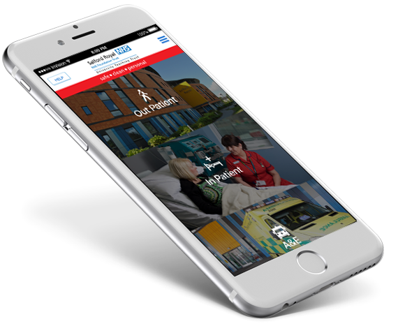

Client: Salford Royal Hospital (NHS) Project: ios & android App Role: UX/UI Designer
Salford Royal Hospital app is a personal guide to the hospital, it provides information to Out Patient, In Patient and Visitors. It also helps them to find all of departments and wards locations, including the Emergency Department (A&E) facilities throughout the hospital.
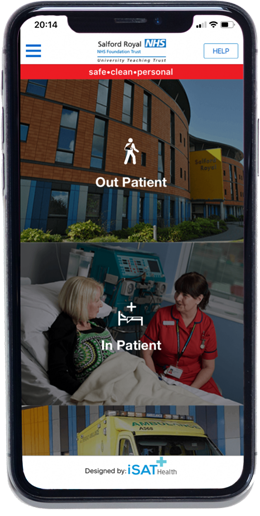
Patients and visitors need to have access to basic information about the hospital such as contacts, visit hours, way around the hospital, where is a specific department located, where to park, what information do they need to go before an appointment, etc.
- Ease a possible anxious and stressful journey a bit easier by providing users with quick access to information about the hospital.
- Compile all the hospital website information, leaflets, maps, and departments information and create a seamless and effective user experience. Making the access to information about the hospital quicker and easier to find for inpatients, outpatients, and visitors.
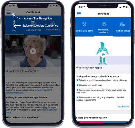
To make the user journey more intuitive and easy, was used a colour system to identify hospital areas and departments that makes the colour system used within the hospital.
It was also used iconography and other visual elements as maps to help users not only to navigate through the app but also within the hospital and to make it easier for them to identify certain type of information.
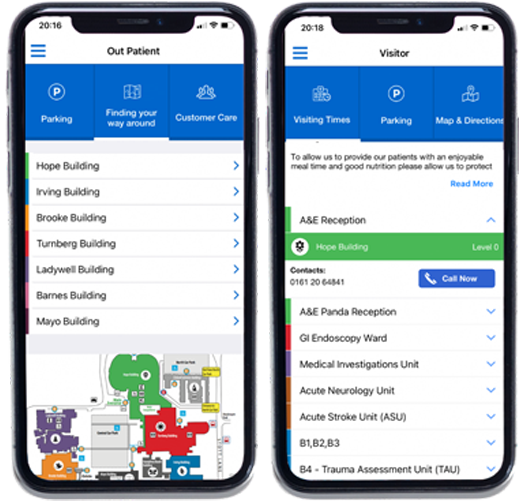
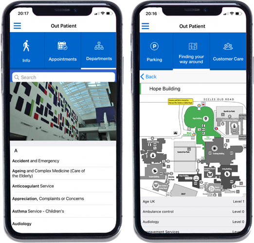
The main navigation is made on the top featuring a tab system what users can swipe left or right to navigate through all of the tabs.
The tabs are created based on the information that user is looking for on a specific page and type of user - in patient, outpatient and visitors.
The main goal of the app is to be accessible to everyone from everywhere - within the hospital, on the way to the hospital and at home.
Accessibility standards were applied across the app - contrast colour, typography, font size, videos and it was also included a Help section to guide user on to better customize the app view to their needs.
A walkthrough is also provided to guide users they can take the most of all features and to better navigate through the app.
On this process my role was to identify the problem to research, plan out how the user experience would look like, ideas generation by sketching and wireframing and finally the UI design of the app.
The design process for this app started with a discovery phase that allowed to understand the main issues that inpatients/outpatients and visitors face when they try to find information about the hospital and to understand the client’s goals.
Users research and user feedback analysis was made to understand their problems and it was also analysing the type of content information that have already need created.
With all information gathered was time to start defining how the app would look like in terms of user experience. Defining user stories, user journey, architecture, and type of content.
Sketches and wireframes were created to explore hypotheses and to start validation solutions with both client and users and iterate with it until we were sure that the solution would work. And then finally moving into the UI design of the app.