Stretford End App
UX and UI Design
Client: Stretford End Project: ios & android App Role: UX/UI Designer
The Stretford End app provides all Manchester United's official statistics. The main goal was to deliver a solution which provides Manchester United fans with access to all the statistical information about Manchester United football club.
The client of this project has researched and collected through the years information about Manchester United matches, results, managers, players, etc. And he wanted to share it with another Manchester United fans.
The client already owned a website but from users’ feedback, he understood that users would like to get access to that information on the go – a mobile app.
The client has identified that Manchester United fans would like a place where they could access to all the Manchester United match results, stats, managers, and players on the go.
The information to be make available on the mobile app goes back to the begging of the club. Which make the display of all the information on a small screen as in a mobile device and easy to access by the user even more challenging.
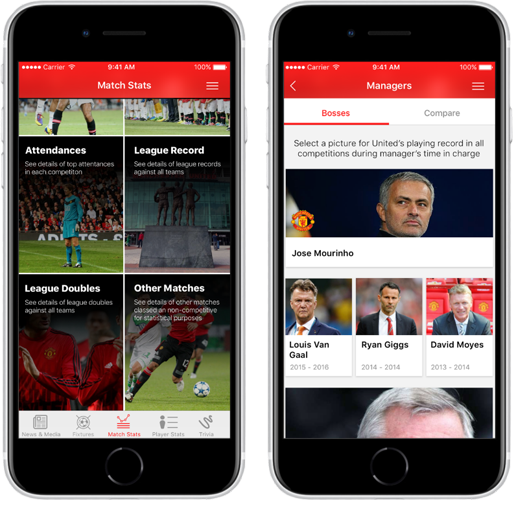
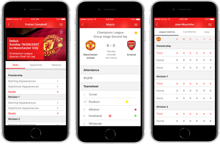
Also, important to consider the variety of type of information and the most effective way to present them, for example stats can be presented as a chart but in other hand matches results needs to be presented in some kind of table that would allow comparison with other results.
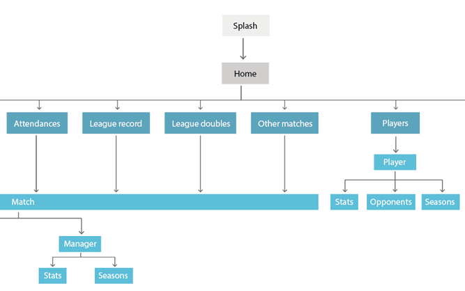
Due to the specificity of the content, getting the information architecture right was one of the main goals when reaching the definition stage of the project.
There was a couple of iterations on finding out the best way to make all the information accessible on the mobile app and it was necessary to add a step to get user feedback before start working on the ideation stage to make sure that the information architecture defined was in line with what the user would expect it to be.
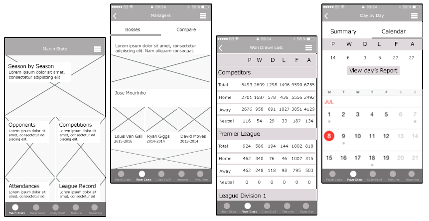
After defining and validating the information architecture, was time to start with an ideation stage starting with some sketches and wireframe to define how the screens would look like and to get focuses on space allocation and prioritization of content, functionalities available, and intended behaviours.
At this stage, was also important to get user feedback to validate the interface design concept before starting to define all the mobile app UI.
As well as the information architecture, the definition of how the user would navigate through the app was also very important. It should be easy for the user to navigate through all the screens of the app and through all the different types of information.
The navigation between the different types of content needed to be simple and flexible – allowing the user, for example to have an overview of all matches from all seasons and from them to find specific information as for example how a specific player performed.
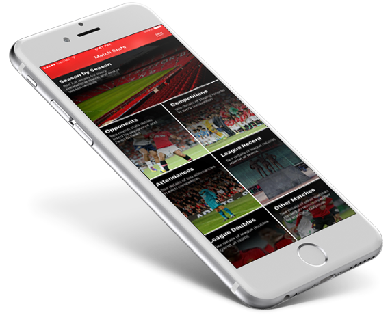
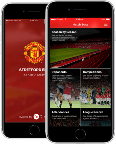
Throughout the app, the information was compartmentalized into different categories to make it easier and more intuitive for the user to find specific information. A good example of that categorization is the home screen where the user is presented with a different set of categories and from there, he can easily find what is looking for.
It was important to display the different types of content in and efficient way for the user to easily find and understand the information.
Most of the information displayed on the app are match results and performance stats, so it was necessary to evaluate the best UI component to display the content. And for that reason, it’s common to find elements as results and comparison tables, lists, filters and view tabs.
On this project my role was UX & UI Designer and I started working on it on an initial phase where the client was still evaluating different companies.
I initially worked on a concept board to be presented to the client as part of the sales efforts and once the project was won, I started to work with the client to understand his vision, user’s problems, and goals as well as requirements.
A few user interviews were conducted and there was an important initial stage to evaluate all the information that the client as compiled and identify the most effective ways to present it.
Throughout the project was necessary to include user feedback gathering in different stages to understand and validate if the way that we were planning to display all the information was in fact the best way.