The House Crowd - Dashboard
UX and UI Design
Client: The House Crowd Project: Dashboard Role: UX/UI Designer
The House Crowd is a Peer to Peer Property Crowdfunding company that allows users to invest online. Once they register on the website, they will have access to a member's area (dashboard) where they can view and manage their investment portfolio.
My role at this project was to improve the overall user experience and UI design.
The House Crowd needed a refresh on their web app, in terms of user experience and designs. To be able to invest on The House Crowd investment product, the user would have to register and will get access to a dashboard area where the can view and manage all their investments.
From user feedback, was learnt that user sometimes felt confusing on where to find specific information about their investments. So instead of relying on the dashboard area, users often contacted the customer support team.
To understand better the problem, I’ve started with a usability audit on all the platform to identify issues and areas to improve.
- It’s difficult for users don’t find what they are looking for.
- Usability issues found on the usability audit and research.
- UI designed needed to be updated.
It was decided that the improvements would be made in stage, and it would be looked like an optimization process.
The challenge was to determine the priority of the issues that should be fixed and how should they be addressed.
One of the identified issues to fixed was how users navigate between pages. Due to “broken” links and multiple menu item taking the user to the same page.
It was necessary to do an evaluation and rethink the information architecture of the web app, as well as define all the user stories and scenarios.
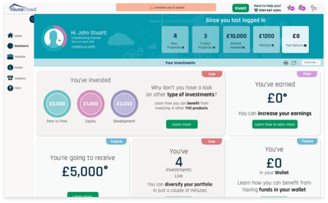
The main navigation was moved to a collapsible side navigation and the top bar is still used to display the invest button in a prominent place as well as other quick access menu items as reminders, Wishlist and settings.
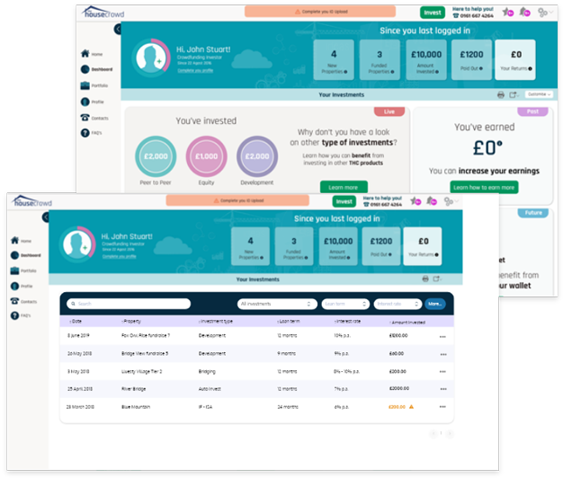
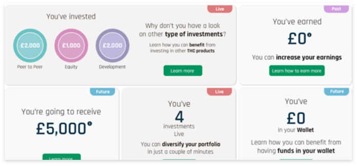
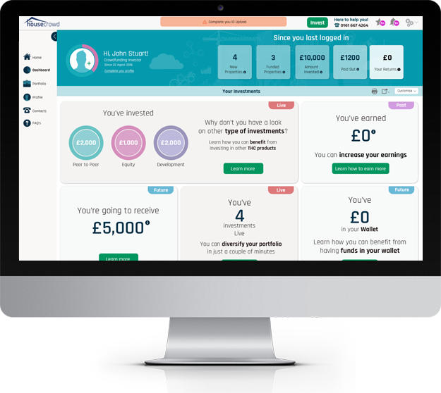
Improving the way how data was presented to the user was one of the focus areas. During user interviews, a considerable number of users mentioned that their investment stats were not presented in a clear way.
A dashboard page was created the main web app landing page, so every time that a user access to their account they would be taken directly to the dashboard page. The new dashboard page was fully dedicated to present investments stats to the user – the past and current performance as well a future prediction of their investment.
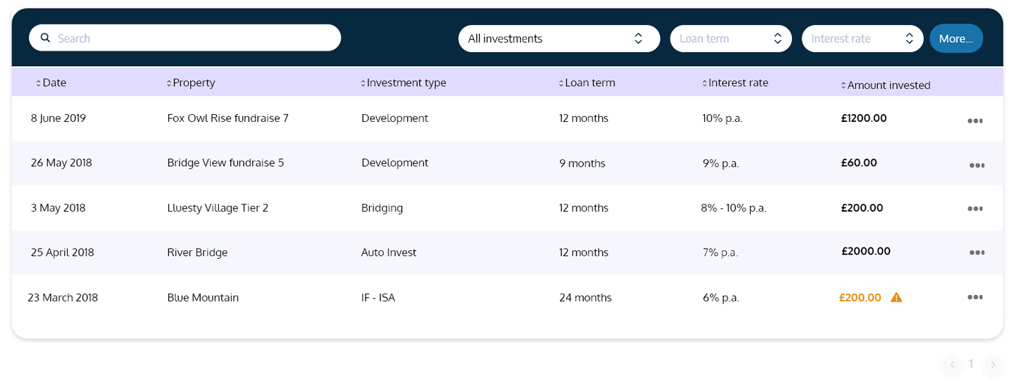
The best way to represent those stats was by using clear and concise infographics, charts and data tables that would user to have a clear overview and understanding of their investments.
The research stage of this project was very important not only to understand the web app issues but also and to understand the user problems, needs and goals.
It was used a combination of quantitative and qualitative research methods that helped to understand the full extend of the problem and where to improve.
As the decision was to approach the project from an optimization perspective and not a full and sudden redesign, it was essential to prioritize what issues, features or designs improvements. A/B and MVT testing were used to validate hypotheses and determine which one created more impact on conversion.