The House Crowd - Website
UX and UI Design
Client: The House Crowd Project: Website Role: UX/UI Designer
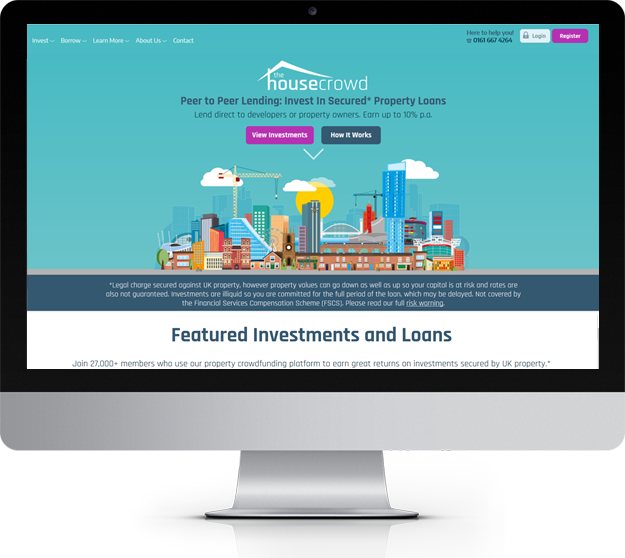
The House Crowd is a Peer to Peer Property Crowdfunding company. It allows investors to invest on property investments online. Users can find all the information they need to start investing on the website and all members (registered users) have access to a dashboard area to view and manage their investment portfolio.
My role at this project was to define all the user experience strategy and UI design. The House Crowd needed a refresh of their website, in terms of user experience, design and content. The main goal was to drive more visitors to become investors and this way increase the overall ROI.
From UX perspective, the focus was to make sure that users were able to find all the necessary information to make the decision to invest and be able to successfully register as an investor and invest on their first property.
- Website needed a visual design update
- Users felt that information was not clear when it to how it would work.
- User experience needed to be improved
Image needed to be efficiently updated. The brand image was around the use of cartoon styled images that looked very outdated, cartoon looked very rigid, and they didn’t transmit emotions or empathy. However, from speaking with users I could understand that most of them thought that the use of those cartoon made The House Crowd distinguish from the competitors. User felt that those cartoons transmitted personality and friendly environment.
The challenge was to make the website have an updated look and feel using outdated and very rigid cartoon images.
Cartoon images were improved – simplified style that was able to transmit more emotion.
The carton images used on the old website were basic of people and none of buildings or other type elements connected to the nature of the business. On this new version, there was more emphasis on buildings and other elements that related to the business.

One of the main focuses on this project was to improve the user journey for potential investors users, so all aspect of the registration and investment journeys was very carefully designed.
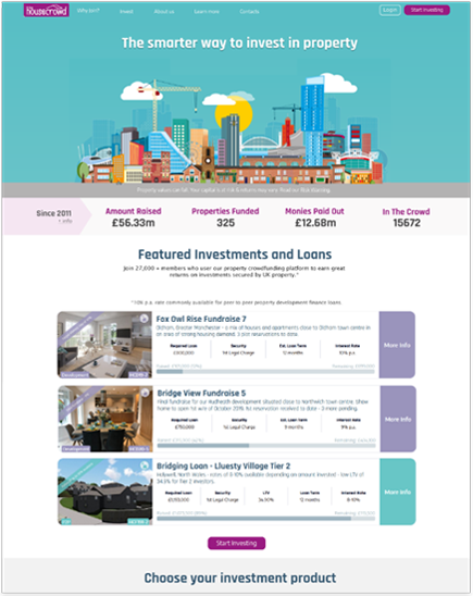
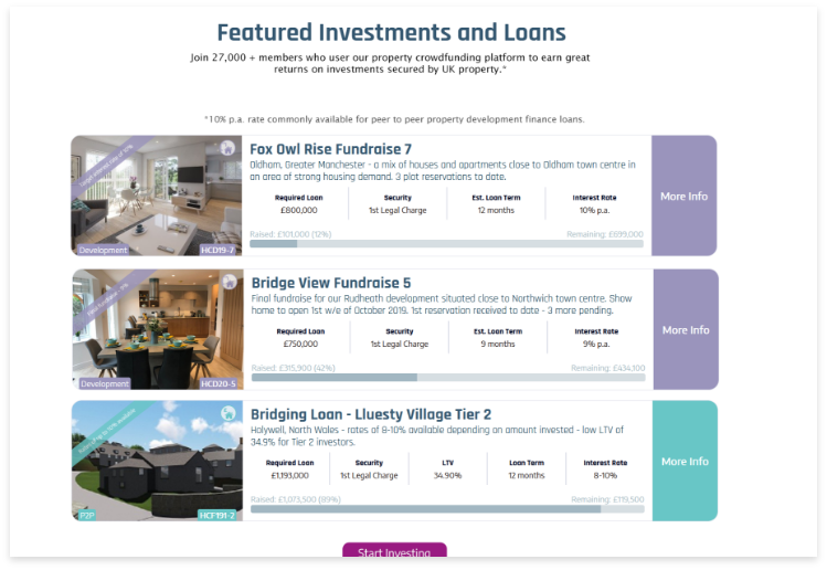
One of the features that was improved was a listing of property investments. The listing become more prominent with properties images, different colours and icons were designed to help distinguish the type of investment and content information clearer a highlighting the important topics that an investor needs to know before making the decision to invest.
The content was redesigned to be clearer and provide all the information that a user needs when he needed. For this reason, was used contextual features that would adapt and display information depending on the user choice and/or scenarios.
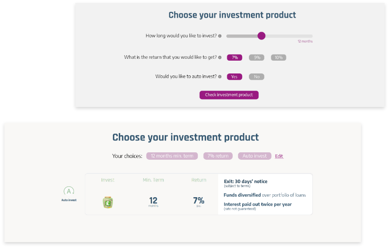
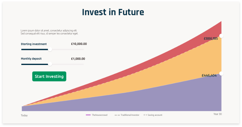
Implementation of charts that allow user to get a prediction on how their investment would look like and how much profit they could make. This feature main goal was to encourage users to invest.
This project needed a considerable amount of research, not only to understand the user, their problems and needs but also the industry and regulations. As the website have investment products available regulatory rules need to be taken in consideration, as for example displaying disclaimers in specific pages and with specific styles guidelines (font size for example). All of these needed to be considered before starting the redesign.
I’ve also conducted some A/B tests on the old version of the website that allowed be to quickly understand how some changes would impact the user behaviour.
When all research was done, it was necessary to work together with marketing to understand what type of content would be displayed and who could we make the content to be easily to be understood by the user and define what type of content elements could we use – videos, diagrams, charts, etc.
After research, I also started to define how the user journey would look like, define scenarios, user’s stories, and journey maps. From there, I started to sketch and wireframe some ideas and discuss them with business, development, and marketing teams.
User testing was made in some more critical areas of the website on a wireframe stage so we could find earlier on if there were other changes and considerations that needed to be made.
When all the ideas and wireframes were validated and approved, the project went into design stage and from there to development and an interactive process of testing, measure, redesign improvement and implementation with the aim to optimize the user experience.